Common Mistakes When Using A Pie Chart Generator

Pie charts are a great visualization tool, but can also be a confusing one. Some of the most common mistakes when using a pie chart generator are using too many slices, having unnecessary labels, and trying to use more than 3 or 4 categories. Another mistake is not knowing how much space you need for your chart image. In this article, we will explain how to use pie charts correctly.
1) Use of too many slices/too little spaces
When creating a pie chart, the most important thing is to make sure you have enough space for your data. If not, there are only two options: remove unnecessary pieces of information or enlarge the whole image. There is no middle ground here. When using a pie chart maker, you need to know what information is necessary and then see if the image needs enlargement. If so, you will have to choose between removing pieces of data or making them bigger.
2) Labels on the edge of the image
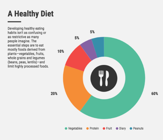
Pie charts are one of those rare cases where adding unnecessary information works. But only when you need to show relative changes instead of absolute values. When you make a pie chart and use labels, always make sure that they are placed inside the circle or outside of it. Never place them near the edge. For example, labels like the one on the image below are confusing because they look almost identical to axis labels.
3) Using too many slices/categories or not enough
Pie charts are great when you have a small number of categories. However, it is hard to compare different pieces of information when there are more than 4 categories in total. It is especially tricky when you want to compare the size of each piece of data. If there are too many pieces of information, it is better to use a different chart that will allow for easier comparisons.
4) Trying to show too much information
Pie charts are great for showing percentages and comparisons between the size of different categories/slices. However, it can be difficult to use them for showing absolute values or breaking down whole numbers into percentages. This is because the human eye does not usually read and compare fractions very well. If you want to show both pieces of information (absolute values and relative changes), it would be better to use a line graph where you can break down your information into different parts.
5) Forgetting to add some background information to your pie graph
Pie charts can be used for a lot of interesting purposes, such as advertising and promotions. However, pie charts are not very commonly used because they can be hard to read on their own. If you want to show how much information is in your pie chart, always remember to add some background information. This will make it easier for your readers to understand the whole image. You may include your pie chart on white paper, for which you can find templates on Venngage.
6) Using a pie chart creator to compare values
Using a pie chart for comparing values is generally not advisable. There are exceptions, of course, but if you want to use it for this purpose, make sure that there is enough space and your readers know how to read the image. In general, it is better to use a graph with two axes instead of a pie chart for comparisons.
7) Pie charts are not suited for everything
Pie charts have been used for a very long time and were the only available option in some cases. Nowadays, many other types of images can be used to represent your data. It is always a good idea to choose the type of chart that will show your information in the best way possible.
8) Not allowing for direct comparisons between slices
Pie charts are very useful when it comes to showing relative changes. However, they are not the only type of chart that can be used for this purpose. If you want your readers to compare different pieces of information, make sure that there is enough space and the labels are clear enough. There should also be a specified scale that the pieces of information are compared to.

9) Forgetting about what is outside of your circle
Pie charts and other circular images (such as Venn diagrams and radar graphs) can be tricky when it comes to what you should show and what you shouldn't. If there is any information that would be useful to your readers, make sure that you are not hiding it. Using images, in general, can be tricky when it comes to finding the right balance between what is outside of your image and what is inside of it.
Takeaway
A pie chart is a circle graph that is a great tool for showing the breakdown of a particular topic. However, it's important to use them correctly and effectively, or else your audience may not understand what you're trying to convey. Remember that if you feel that a pie chart is the best image for your data, there are some things you'll want to keep in mind if you want the pie chart to be effective.
Subscribe to Latin Post!
Sign up for our free newsletter for the Latest coverage!


