Minnesota Reveals New Flag Following Decades of Criticism of Old Design
A significant step towards a modern and inclusive representation of Minnesota was taken on December 19, as the State Emblems Redesign Commission announced the selection of a new state flag design, according to FOX News.
The commission, with an 11-1 vote, approved the design created by Andrew Prekker of Luverne, Minnesota, who modified his original submission, F1935, to create a symbol reflecting the state's identity.
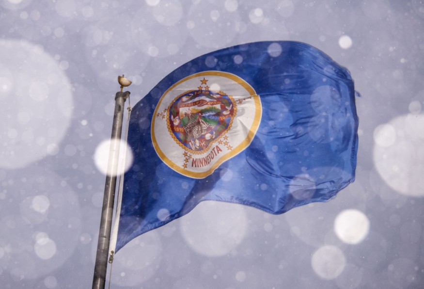
Prekker's design features an eight-pointed star against a navy blue background, symbolizing Minnesota's unique shape.
Adjacent to it is a solid light-blue field, representing the state's abundant waters.
The navy-colored abstract shape of Minnesota serves as a backdrop to the white star, embodying the state motto, "L'étoile du Nord" ("Star of the North"), and conveying a message of unity above a diverse land.
The initial design of the new Minnesota flag included three color stripes-white, green, and light blue-each with its symbolic significance.
However, the final version opted for a solid blue field, emphasizing simplicity and meaningful symbolism.
The white stripe represented snow, the green stripe denoted the beauty of nature and the historical role of agriculture, and the light blue stripe signified the importance of water in a state known for its lakes and rivers.
Minnesota's name, derived from a Sioux word meaning "sky-tinted water," adds historical and cultural depth to the symbolism.
The redesign aimed to address concerns about the controversial imagery of the state's original seal and flag, criticized for its depiction of Native Americans.
Debut and Symbolism of the New Minnesota Flag
The new Minnesota flag, along with the state seal approved earlier, is set to debut on May 11, coinciding with Statehood Day, per CBS News.
While the legislature does not need to provide final approval, the commission will submit a report detailing the designs and the redesign process by January 1.
Commission Chair Luis Fitch passionately supported the final design, emphasizing the paler shade of blue resembling the Mississippi River pointing to the North Star.
Fitch noted that this metaphor encapsulates what drew people to the state throughout history.
However, the panel experienced internal debates over design elements, particularly the presence of a green stripe.
Member Denise Mazone advocated for retaining the green stripe, symbolizing the richness of the land, but was the sole person voting to reject the final design.
"We all have our feet on this land. We have so much riches in the land that we put our feet on and that's why I thought it was so important that we recognize green as well," she said.
Historical Context and Criticism of Previous Symbols
Minnesota's original seal, created during its territorial phase, depicted a white settler plowing a field while a Native American on horseback rode into the sunset, Star Tribune reports.
The imagery, celebrating the dominance of white settlers, has long been criticized for suggesting the defeat and departure of Indigenous people.
The current Minnesota flag has faced criticism for its controversial representation, both from Indigenous tribes and flag enthusiasts.
In a ranking video by CGP Grey, Minnesota's flag was labeled the "worst in the union," highlighting its intricate design.
The new Minnesota flag, adhering to principles of simplicity, meaningful symbolism, and distinctiveness, has received praise from experts, indicating a positive shift towards a more universally accepted state symbol.
Dr. Anita Gaul, vice-chair of the commission, remarked that the new Minnesota flag has gained approval from flag experts, transforming from an "F to an A+" in their eyes.
Read also: Arizona: 5 Children Dead in House Fire
This article is owned by Latin Post.
Written by: Bert Hoover
WATCH: Meet Minnesota's new state flag! - From WCCO - CBS Minnesota
Subscribe to Latin Post!
Sign up for our free newsletter for the Latest coverage!
© 2026 Latin Post. All rights reserved. Do not reproduce without permission.


