How to Design an Email Footer
Design of today's emails is rather diverse. It varies from basic text-based templates to sophisticated off-grid creations with elaborate color palettes. You can combine several designs within your email marketing strategy to fulfill the marketing task of each particular campaign. But whatever template design you stick to, a footer will be one of its required components.
A footer or an email signature is a section that goes at the very bottom of the email. It can include only basic contact details or more complete company info.
What you can add to a footer:
- Company contacts (physical address; email, phone, support contacts);
- Social media accounts;
- Logo;
- Privacy policy;
- Location map;
- Terms of use;
- Legal disclaimer;
- Reason why the user receives this email;
- Unsubscribe link;
- Preference management;
- View in browser link;
- Site menu;
- Current offer conditions;
- App download buttons
- Friend reference;
- Rating request;
- Email authors, etc.

Email footer example
As you see, footer elements are numerous and it's up to you to use or not any of it in your footer. Except for the unsubscribe link.
What about the unsubscribe link?
An unsubscribe option is an official requirement by the GDPR and many other customer policies. They claim that users should be able to unsubscribe from your emails at any time in an easy way. This means an unsubscribe link should be included in every email, should be visible and easy to spot.
Some marketers are afraid of the unsubscribe link. They think that if they add it to emails, people will start unsubscribing massively. Therefore, they hide it behind other text or use a tiny font size or almost invisible color. Don't be like them.
People who no longer want your emails will leave your list anyway. They can do it by either using the unsubscribe link or by sending you to spam. And you definitely don't want the last option.
Actionable Tips on How to Create a Good Email Footer
Stick to a clear structure.
It's actually easy to create a good email footer by following one simple rule: less is better. Line space, white space and horizontal bars are your best friends when it comes to designing a footer hierarchy.
Remember that a footer is the most functional element of the whole email. Its aim isn't catching attention or selling but directing the person when they need it now, be it a store location, contacts or privacy terms.
Take a look at these two editions of the same footer design. The first is more user-friendly thanks to enough white space, padding, indent between icons and a bigger font size. Horizontal bars make the bottom links more visually distinctive.
The second design looks too tight. The logo almost overlaps the links that look like one sentence and not separate pieces.
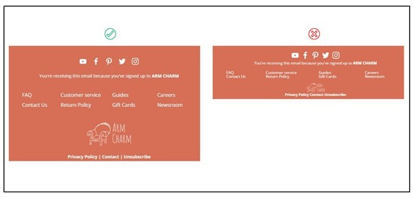
Clear footer design vs. too squeezed design
In too long copies, you may have limited space but don't extend it at footer's expense. It's better to remove some elements, say a logo or menu, but keep the whole section clear and easy to navigate through.
Another strategy to draw the line between footer elements is to use a different background color for structures or stripes. Make sure the colors comply with the overall email design and don't create a color cacophony.
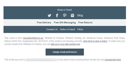
Footer from the email by Whittard of Chelsea
Add icons where applicable.
Images are scanned faster than text. They support text for people who aren't native speakers of the language your emails are written in. They are better perceived by people with reading disorders or visual challenges. So if your copy allows, consider adding icons, pictograms or images to make your messages more accessible.
Look at this footer from the email by the French children's clothes retailer Jacadi. Although the text is in French, we understand what it's about even not knowing French thanks to the icons and images.
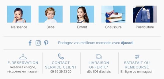
Footer from the email by Jacadi Paris
Add a preference management link.
The more diverse products you sell and the more categories you have, the more subscription categories you need to offer for your emails. People who buy from you only a particular type of product may not be interested in the rest and don't want to receive the corresponding messages. They also may not want partners' offers or event notifications.
That's why giving an option to manage their preferences is important. Instead of unsubscribing, people will just opt out of irrelevant content. And you'll have more data for customer segmentation and more precise targeting.
The thing to make sure is proper transfer of the data from the subscription management page to your CDP or email service provider. Because if you ask people about their preferences but don't comply with them and still send out all your campaigns, don't expect much following.

Footer from the email by Food52
Add an app download button.
Your subscribers, especially newcomers, aren't familiar with your brand much. They may not know all the platforms you operate on. So If you have an app, consider adding a download button to the footer.
Add the offer conditions.
When you send promo emails with sales that are valid under certain conditions, specify these conditions in the footer. Remember though that nobody likes to read long plain texts so try to make it easier for your subscribers to read them. Even if the text volume is big, put it in short sentences and split them into several paragraphs.
Not only disclaimers protect you from legal claims, they also give important clarifications that otherwise would be required of your support team. So your task is to make them as comprehensible as possible.
To Sum Up
A footer is as important element of your emails as the rest of the copy. Although it's located in the bottom, it's where everyone looks for contact information, links and social media accounts. A poorly designed footer can spoil the whole campaign experience so think it carefully. Stick to the golden rule that is clarity first and avoid messy layouts.
Author's Bio

Iuliia Nesterenko is a technical writer at eSputnik. Her focus is on exploring current digital marketing trends and describing new strategies for email marketers.
Subscribe to Latin Post!
Sign up for our free newsletter for the Latest coverage!
© 2026 Latin Post. All rights reserved. Do not reproduce without permission.


